Dummy Satellite Image Classification
Introduction
This project is the equivalent of a “hello world” program in the computer vison realm targeting a very simple image classification task. Its objective consistend in training convolutional neural networks, specifically with the ResNet architecture, in order to classify satellite images.
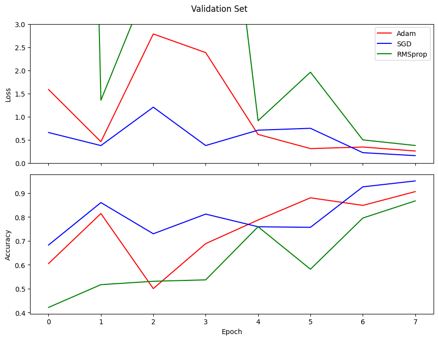
During its execution apart from implementing the data preparation, training and evaluation routines; 3 different optimizers (namely the Adam, SGD and RMSprop) were tested and compared in the training and evaluation routines. Implementation was carried out with the PyTorch and Torchvision packages.
- Problem domain(s): multi-class single-label image classification.
- Model architecture(s): ResNet (defined and trained from scratch with PyTorch).
- Optimizer(s): Adam, Stochastic Gradient Descent (SGD) and RMSProp.
Dataset
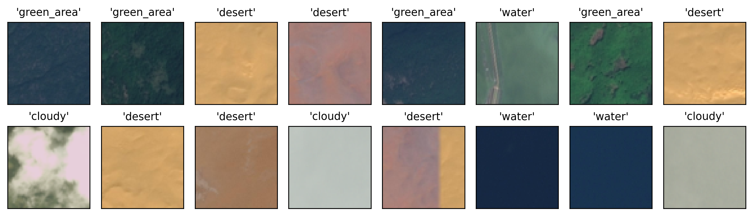
Data used in this project corresponds to Remote Sensing (RS) images stored as .jpg files with relatively
low resolution. Each of the images is associated to exactly one of the following 4 classes:
green_areacloudydesertwater
This dataset can be freely downloaded from the associated Kaggle dataset page. The figure below shows examples for such images as well as their respective labels:
Approach
Results
Performance
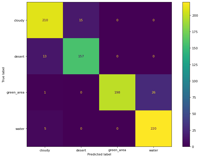
Confusion Matrix
Misclassification Examples
Another interesting way assess the performance is by looking at missclassified instances in the test set. This is a particularly interesting (sometimes even funny) property of computer vision tasks: usually looking (literally) at mistakes produced by models can yield interesting insights as for us humans processing these instances in our own vision system is pretty much effortless. This is particularly interesting in the context of this project as we are dealing with a rather small number of labels, but the same principle could be applied in larger projects aided by some data processing. The image below shows this comparison for our fitted model.

To be honest, I have myself missclassified some of them as I was plotting this chart trying to guess the correct labels. As it turns out, most of these missclassified instances are indeed very dificult, almost guess-like, classifications. The cloudy and water rows depict this issue very clearly as just by the overall texture in the image it is not possible to produce an accurate guess (imagine if these were black and white images). As a last resort, the model tries to use the color as a way to classify them, only to be mislead by the hues in the images: in the cloudy instances, the color is very “desert-like” and for the water ones, the color resambles that of cloudy instances.
For the desert row, with the exception of the middle image, it would be fair to say that both texture and color are misleading the model. The middle image in this row is the kind of “clear error” that requires more attention as none of these two characteristics (color and texture) are that much off in comparison to other ordinary desert instances.
In the green_area row, again, some instances could get away by justifying that both the texture and color (to some extent) are similar to the ones found in water instances. However, once again in the middle image, the presence of shapes (in what seems to be a dirt road) should have provided better information to the model, but the presence of other similar shapes in green_area was not verified, so it may be the case that it simply hasn’t learned to associate straight shapes to the green_area label. This could be solved by allowing